Traveler's inbox enhancement
Traveler's inbox enhancement
TripAdvisor
Traveler's inbox enhancement
TripAdvisor is the largest travel website in the world, where users can find information about hotels, restaurants, attractions, and vacation rentals.
In 2013 I joined the Vacation Rental division of TripAdvisor while they were implementing the MVP version of their direct booking service, where travelers can find a vacation rental, book it, and pay for it immediately. They can also communicate with the property owner using the new traveler's inbox.
Project date
July 2013
Role
Senior User Experience Designer
Designed for
Web Application
Company
Project overview
The MVP version of the traveler’s inbox was released in April 2013 and by July the product team had gathered enough data and user feedback to define a set of design problems that needed to be addressed. The following is a compilation of the problems identified and the solutions proposed.
Disclaimer: This project took place in 2013, several months before the release of iOS 7 by Apple Material Design by Google, making Flat Design the standard design language for user interfaces.
Target audience
The vacation rentals division of TripAdvisor targets travelers from all over the world and from all demographics. The typical vacation rental traveler is traveling in a group of friends or family and is looking for a home away from home, where they can experience their destination like a local and have all the comforts that a hotel cannot offer to a group or family.
PROBLEM 1
Page layout and FAQ placement
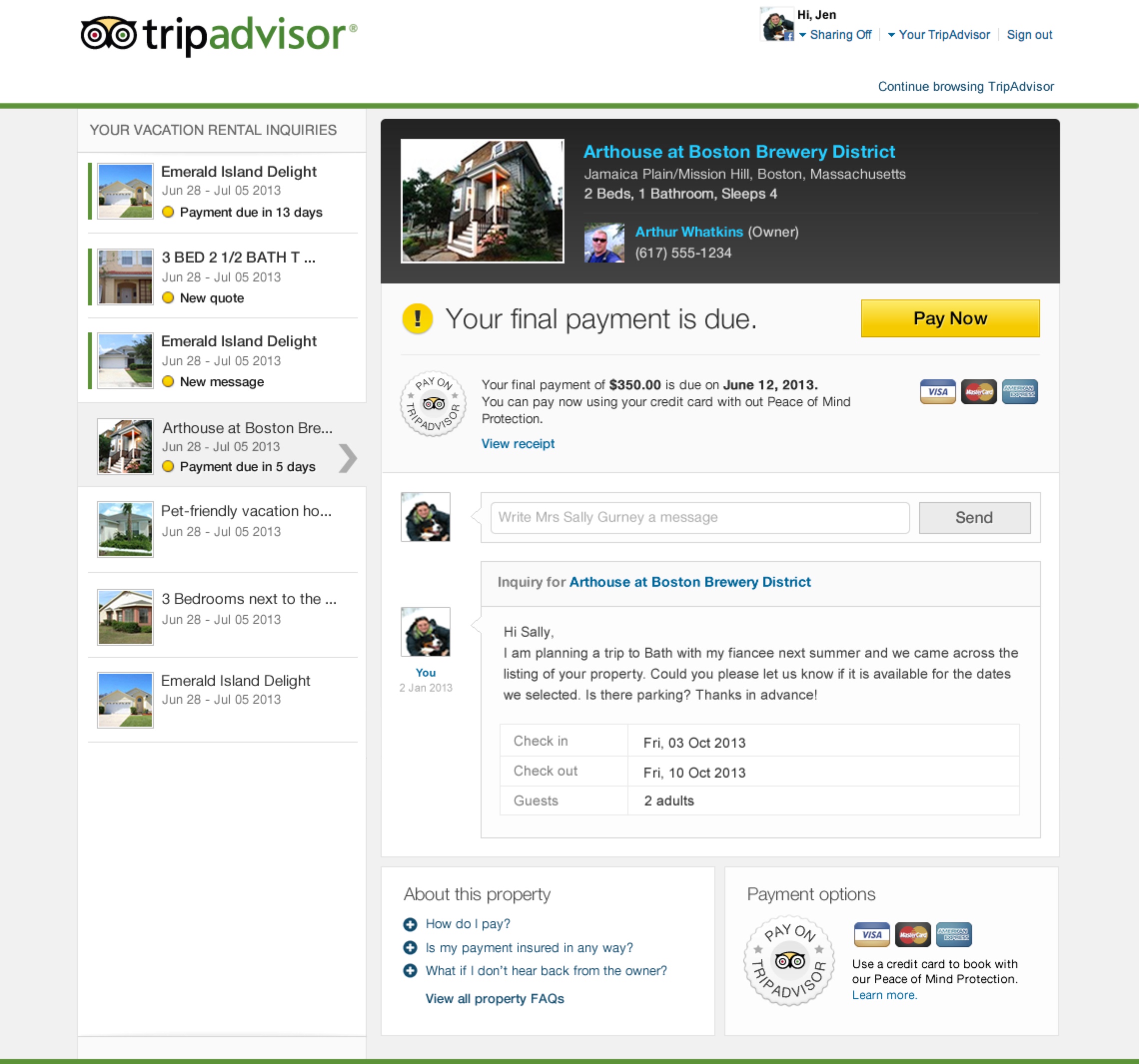
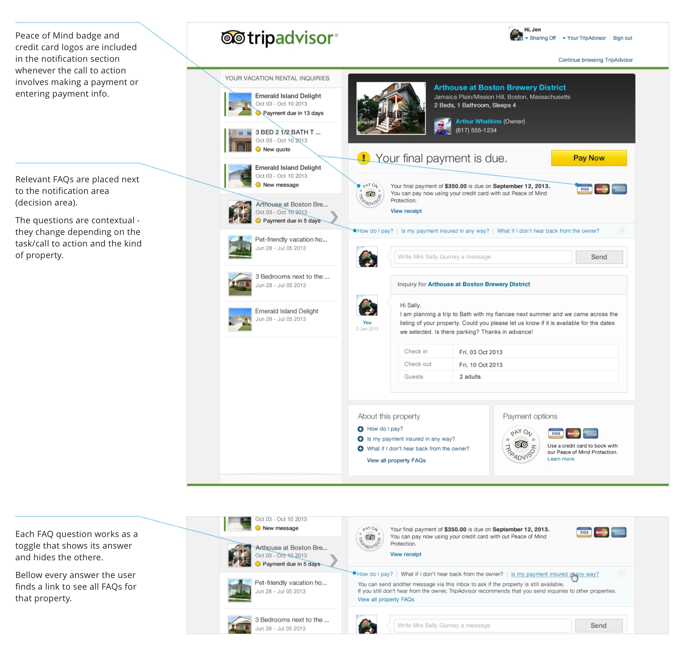
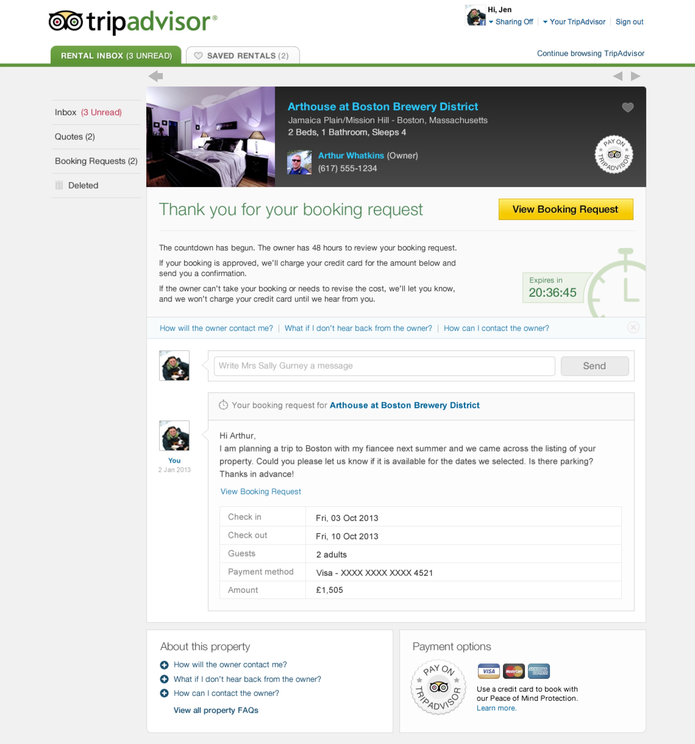
More than 15% of the visits to the traveler’s inbox originating from a desktop computer were done on browser windows 1024px wide. The original version of the inbox included a left rail with a summary of all inquiries and that left rail took too much space in the page. The result was that the main action area was squished and some important information like the FAQs were being pushed down to the bottom of the page.
User feedback showed that users were not reading the FAQ section on the inbox and/or were not sure about how to proceed to make a payment, possibly due to the FAQ section being pushed to the bottom of the page on smaller desktop screens.
Proposed solutions
Improve FAQ visibility and make it contextual
To address the issue of users not seeing the FAQs, I proposed to:
1. Place the FAQ section next to the notification area (decision area) whenever there’s a call to action asking the user to make a decision, i.e. make a payment, contact the property owner, etc.
2. Show contextual FAQs according to the task being performed so the user will see a smaller set of FAQs that is more relevant to the task at hand.
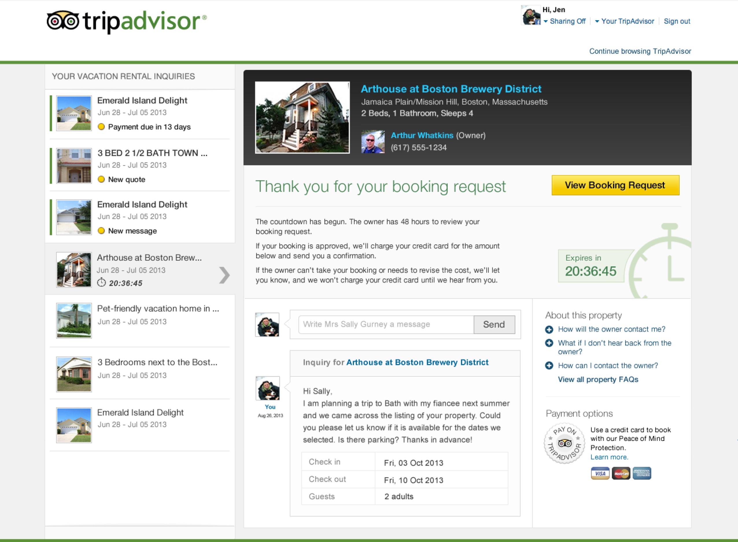
Page layout redesign - Concept 1
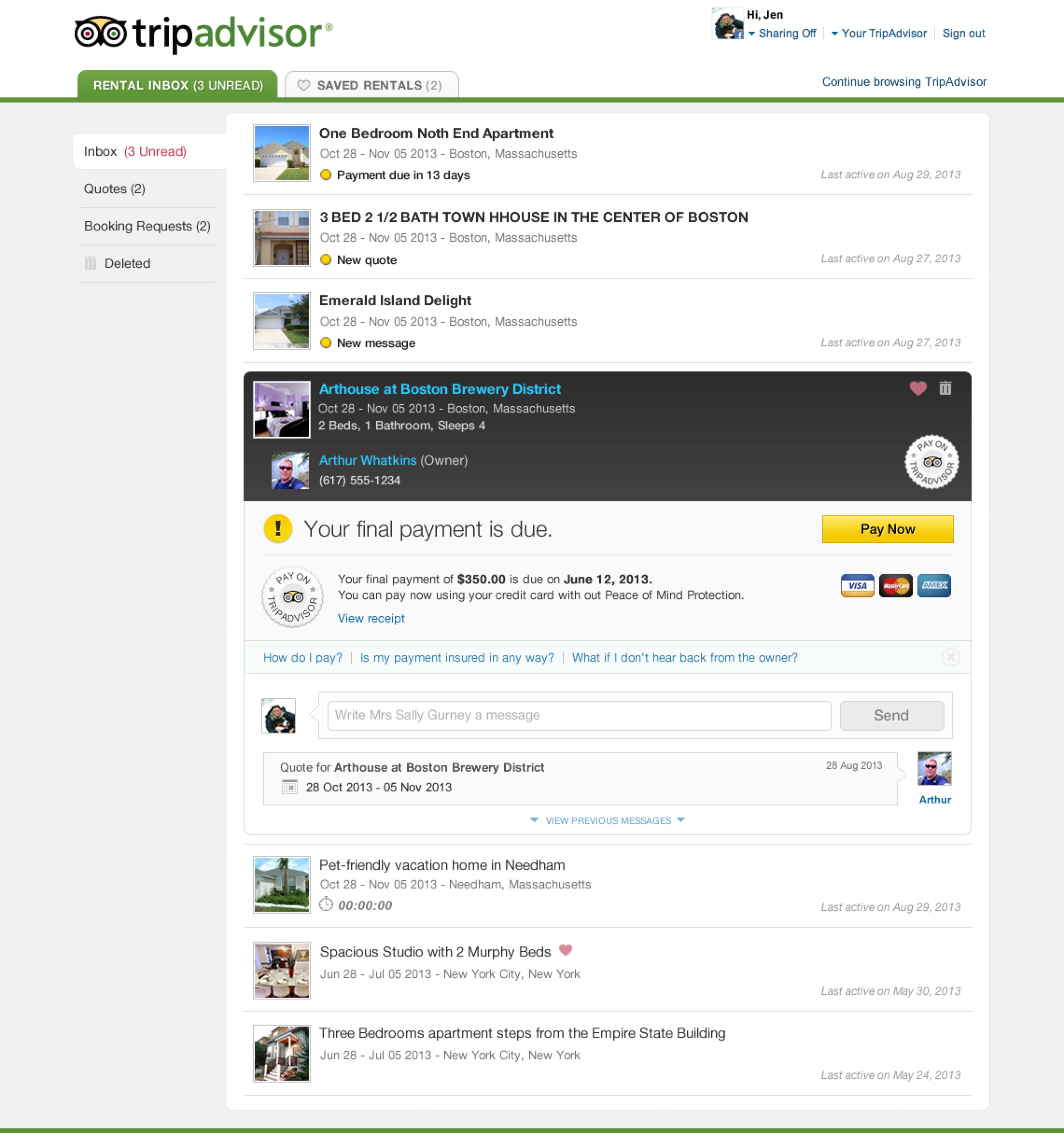
To address the problem around the page layout, I suggested a complete layout change, inspired by a conventional inbox layout (as seeing on Gmail and other email applications). Different folders on the left rail act as filters and inquiries are listed as messages that can be opened individually.
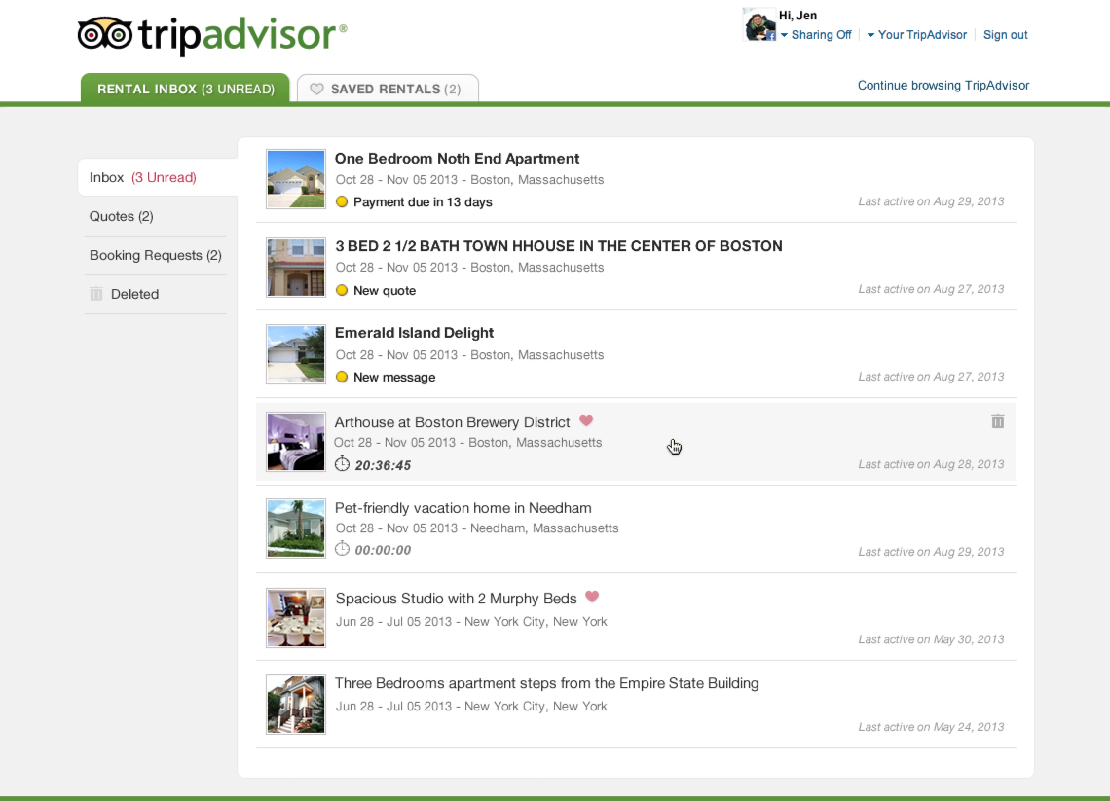
Inquiry list view shows all inquiries and their statuses
Inquiry detail view
Page layout redesign - Concept 2
As an alternative to concept 1, I proposed a solution in which the inbox has expandable threads. Different folders on the left rail act as filters and inquiries are listed as messages that can be expanded without leaving or reloading the page.
This concept was quickly discarded because the length of the expanded message threads could take over all the vertical space on the screen and users would lose reference of the original message list.
Individual inquiries expand on demand to reveal the details about that inquiry without the need to leave the page
PROBLEM 2
Saving vacation rental listings for later
The original save feature for vacation rentals was removed due to low engagement and because it was not clear for users what could be done with the listings saved.
Proposed solution
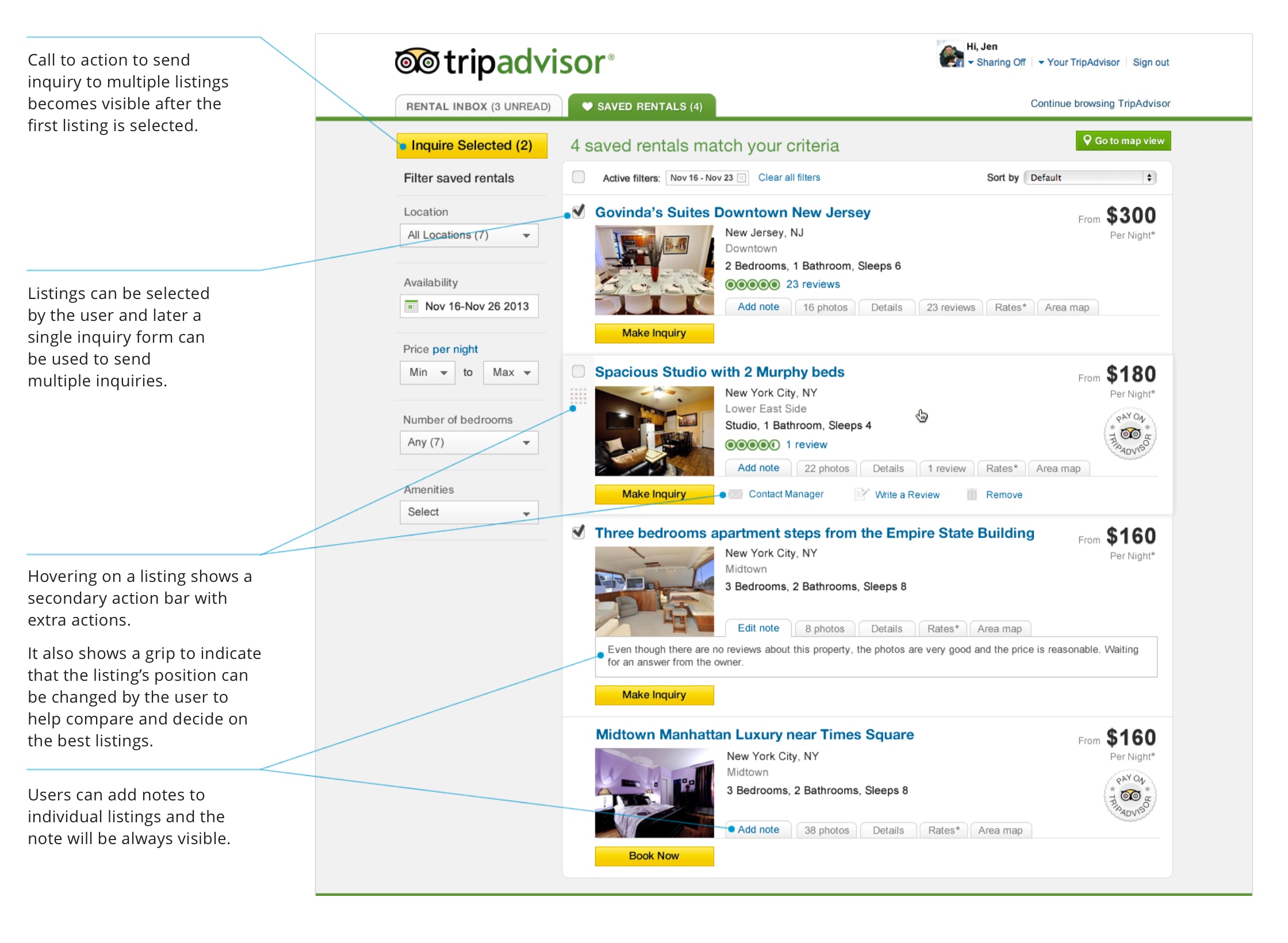
The following solution proposed that the save feature be reintroduced for vacation rentals and to create an exclusive repository for the saved vacation rental listings. It offers tools that add value to the “saving experience”, including the ability to send a single-inquiry to multiple listings to help travelers save time.
Integration of save feature into traveler inbox
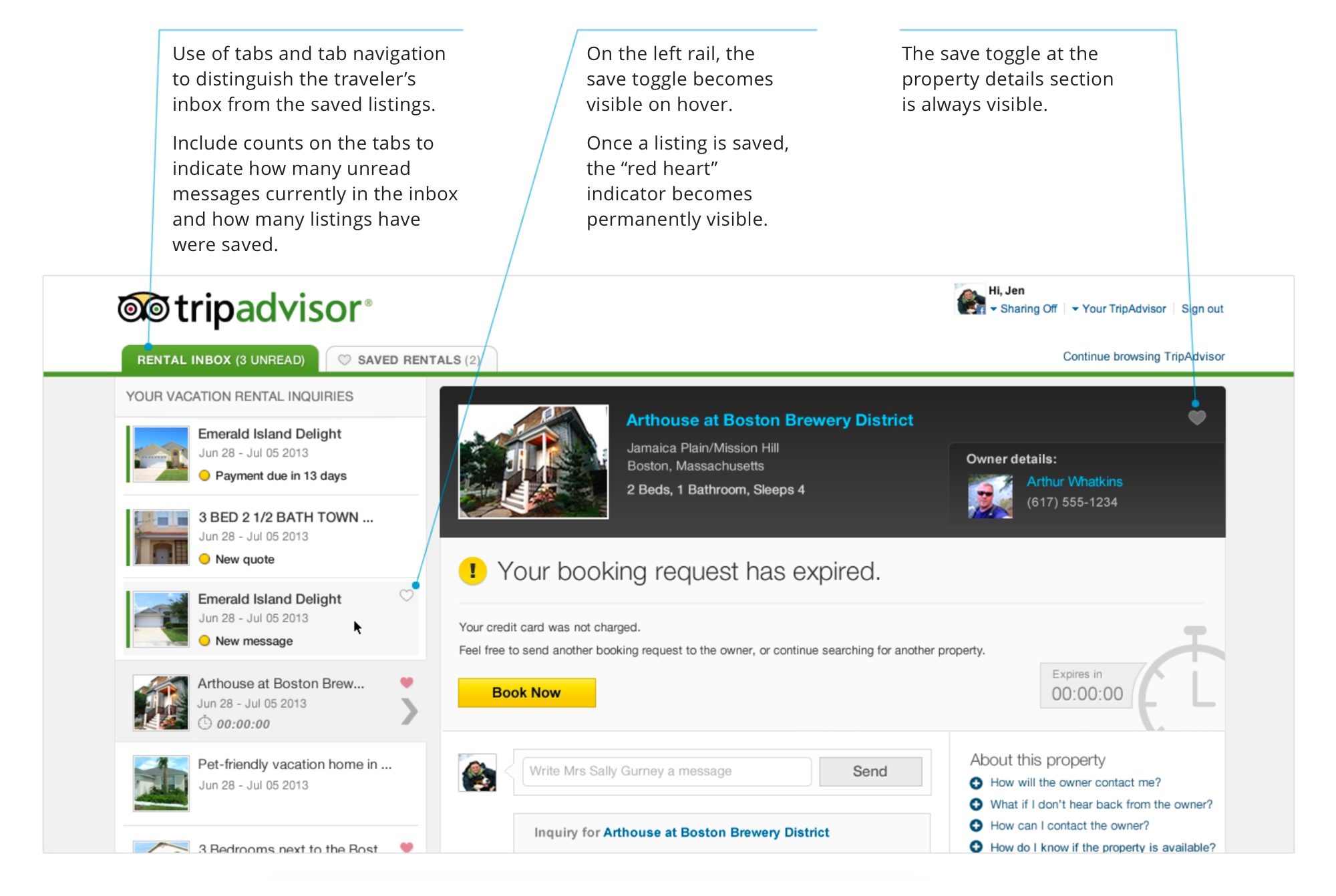
Saved rentals tab
A dedicated page for all the saved vacation rental listings
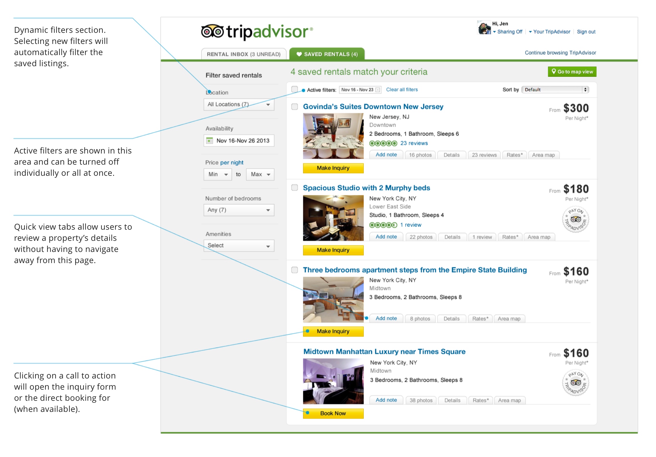
Saved rentals tab with "shopping cart" functionality
Users can save time by selecting multiple saved listings and filling out a single inquiry form to send multiple inquiries.
PROBLEM 3
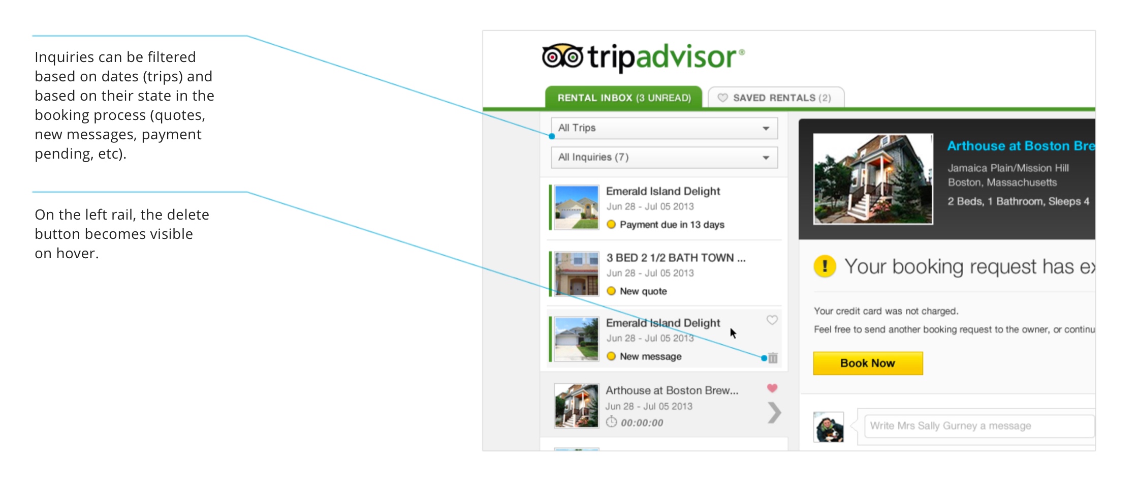
Helping users manage their inquiries
Users needed tools to help them manage and navigate through all the inquiries in their rental inbox, as well as a way to get rid of the inquiries they no longer needed.
Proposed solution
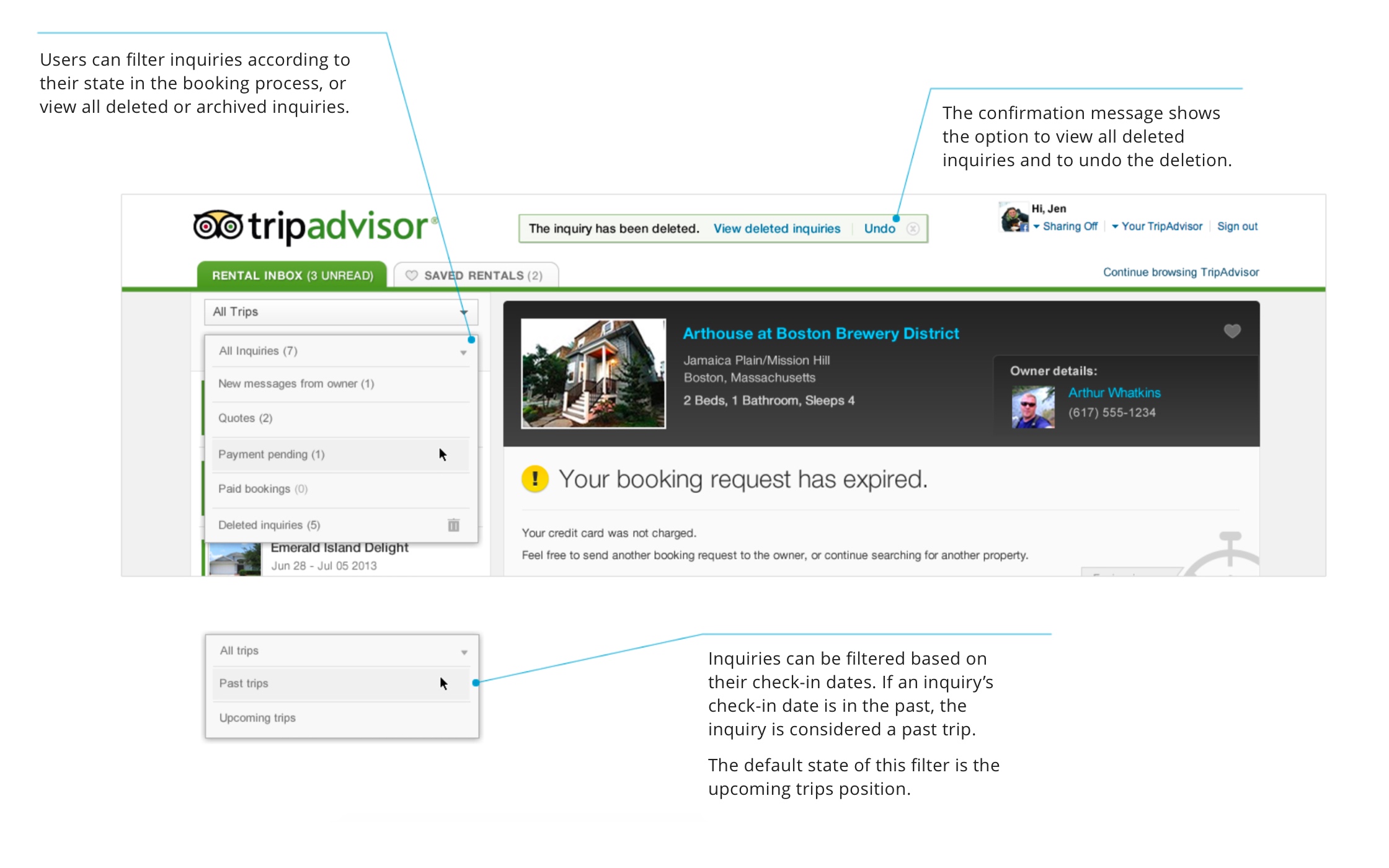
Add filters to the inbox that allowed users to see similar inquiries and reduce the clutter and scrolling. Add the option to delete or archive unwanted or past inquiries.
Conclusion
Some of the solutions proposed were implemented and the traveler's inbox still exists to this day, although it looks very different now.
TripAdvisor was the first company I worked that had a roadmap driven mostly by data and user feedback. I learned a lot during my time there and am happy with my contribution to the vacation rental team.
Next

Improving the learning experience with interactive lessonsPassword protected case study | 14 min read

E-learning: Showing course resultsPassword protected case study | 7 min read

Direct Email Campaign BuilderEmark | 6 min read

Usability Lab Poster SeriesAcademy of Art University | 3 min read